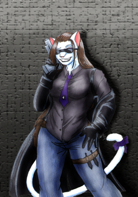
As per Kessie's suggestion in my last entry, I tried to tone down the background a bit. What she suggested, however, was the equivalent of a foreign language because my Photoshop knowledge is limited. So, I went about it my own way. I blurred it quite a bit and then adjusted the saturation, etc., hoping that Kat would pop out more.
Also, I decided today what next week's will be; another original character!
Ah, that is better. The cracks in the background were blacker than the blacks on Kat and it looked weird. Now it's at least all the same value. :-)
ReplyDelete